本文最后更新于:12 小时前
[√] 1 - hexo添加自定义页面 (1)使用:hexo new page study 新建一个自定义页面
(2)主题的 _config.yml 文件中的 menu 中进行匹配
推荐大家一个图标库
https://fontawesome.dashgame.com/
(3)经过以上步骤我们在我们的工作文件夹中 已经生成了index.md文件,定义它的type类型: type : “XXX”,此处我的是: type: “study”,并将title改为中文“学习进度”
成功实现,接下来就可以好好设计你的页面了。
[√] 2 - 在博客中添加进度条
参考:
(1)Bootstrap - 进度条(link )
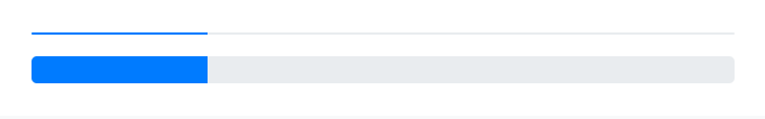
[√] 2.1 - Bootstrap进度条(Progress)知识点 进度条(progress bar)支持堆叠、动画背景和文本标签。
[√] 工作原理
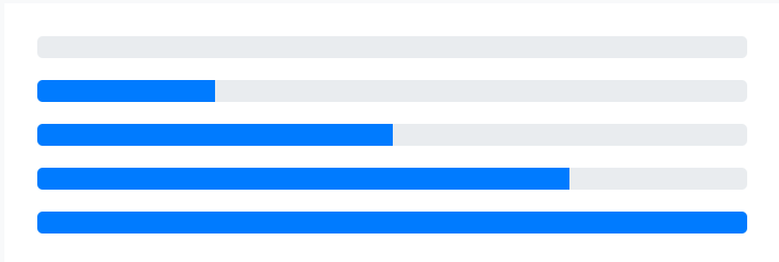
1 2 3 4 5 6 7 8 9 10 11 12 13 14 15 <div class ="progress" > <div class ="progress-bar" role ="progressbar" aria-valuenow ="0" aria-valuemin ="0" aria-valuemax ="100" > </div > </div > <div class ="progress" > <div class ="progress-bar" role ="progressbar" style ="width: 25%" aria-valuenow ="25" aria-valuemin ="0" aria-valuemax ="100" > </div > </div > <div class ="progress" > <div class ="progress-bar" role ="progressbar" style ="width: 50%" aria-valuenow ="50" aria-valuemin ="0" aria-valuemax ="100" > </div > </div > <div class ="progress" > <div class ="progress-bar" role ="progressbar" style ="width: 75%" aria-valuenow ="75" aria-valuemin ="0" aria-valuemax ="100" > </div > </div > <div class ="progress" > <div class ="progress-bar" role ="progressbar" style ="width: 100%" aria-valuenow ="100" aria-valuemin ="0" aria-valuemax ="100" > </div > </div >
Bootstrap 提供了几个 用于设置宽度的工具类 。根据你自己的需求,这些工具类可能有助于你快速设置进度。
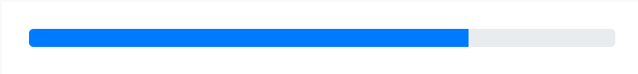
1 2 3 <div class ="progress" > <div class ="progress-bar w-75" role ="progressbar" aria-valuenow ="75" aria-valuemin ="0" aria-valuemax ="100" > </div > </div >
[√] 标签
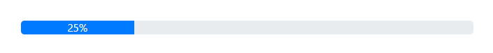
通过在 .progress-bar 元素内添加文本,就可以为进度条(progress bar)添加标签。
1 2 3 <div class ="progress" > <div class ="progress-bar" role ="progressbar" style ="width: 25%;" aria-valuenow ="25" aria-valuemin ="0" aria-valuemax ="100" > 25%</div > </div >
[√] 高度
我们只为 .progress 设置了一个 height 值,因此,如果你改变了该值,内部的 .progress-bar 将自动地调整尺寸。
1 2 3 4 5 6 <div class ="progress" style ="height: 1px;" > <div class ="progress-bar" role ="progressbar" style ="width: 25%;" aria-valuenow ="25" aria-valuemin ="0" aria-valuemax ="100" > </div > </div > <div class ="progress" style ="height: 20px;" > <div class ="progress-bar" role ="progressbar" style ="width: 25%;" aria-valuenow ="25" aria-valuemin ="0" aria-valuemax ="100" > </div > </div >
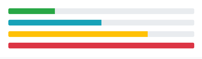
[√] 背景色 通过使用背景色相关的工具类可以改变单个进度条(progress bar)的外观。
改变颜色方法1:
我们可以在progress div中添加类bg-type来改变其颜色。在bootstrap5中有8种颜色的自定义选项。
bg-primary 蓝
bg-secondary 浅黑
bg-success 绿
bg-danger 红
bg-warning 黄
bg-info 浅蓝
bg-light 白
bg-dark 黑
1 2 3 4 5 6 7 8 9 10 11 12 <div class ="progress" > <div class ="progress-bar bg-success" role ="progressbar" style ="width: 25%" aria-valuenow ="25" aria-valuemin ="0" aria-valuemax ="100" > </div > </div > <div class ="progress" > <div class ="progress-bar bg-info" role ="progressbar" style ="width: 50%" aria-valuenow ="50" aria-valuemin ="0" aria-valuemax ="100" > </div > </div > <div class ="progress" > <div class ="progress-bar bg-warning" role ="progressbar" style ="width: 75%" aria-valuenow ="75" aria-valuemin ="0" aria-valuemax ="100" > </div > </div > <div class ="progress" > <div class ="progress-bar bg-danger" role ="progressbar" style ="width: 100%" aria-valuenow ="100" aria-valuemin ="0" aria-valuemax ="100" > </div > </div >
改变颜色方法2:
我们可以使用style参数和background-color属性将进度条的颜色改为任何想要的颜色。要用不同的颜色来创建进度条的某些部分,只需在进度条内不断添加一个新的具有progress-bar类的div。
1
2
3
4
5
6
7
8
9
10
11
12
13
14
15
16
17
18
19
20
21
22
23
24
25
26
27
28
29
30
31
<!DOCTYPE html > <html lang ="en" > <head > <meta charset ="utf-8" /> <meta name ="viewport" content = "width=device-width, initial-scale=1" /> <link rel ="stylesheet" href = "https://maxcdn.bootstrapcdn.com/bootstrap/4.3.1/css/bootstrap.min.css" /></head > <body > <center > <h1 style ="color: green" > GeeksforGeeks</h1 > <br /> <div class ="progress" style ="max-width: 60%" > <div class ="progress-bar" style ="width: 80%; background-color: green" > </div > <div class ="progress-bar progress-bar-stripped" style ="width: 80%; background-color: #66b400" > </div > <div class ="progress-bar progress-bar-stripped" style ="width: 70%; background-color: rgb(141, 3, 72)" > </div > </div > <br /> </center > </body > </html >
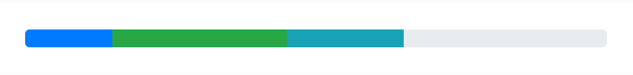
[√] 多个进度条 如果需要,可以在一个进度条(progress)组件内可以添加多个进度条(progress bar)。
1 2 3 4 5 <div class ="progress" > <div class ="progress-bar" role ="progressbar" style ="width: 15%" aria-valuenow ="15" aria-valuemin ="0" aria-valuemax ="100" > </div > <div class ="progress-bar bg-success" role ="progressbar" style ="width: 30%" aria-valuenow ="30" aria-valuemin ="0" aria-valuemax ="100" > </div > <div class ="progress-bar bg-info" role ="progressbar" style ="width: 20%" aria-valuenow ="20" aria-valuemin ="0" aria-valuemax ="100" > </div > </div >
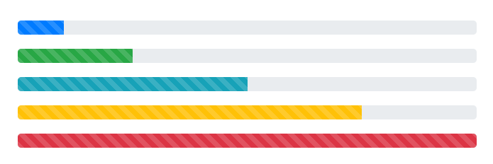
[√] 条纹进度条 为任何 .progress-bar 添加 .progress-bar-striped 即可添加条纹样式,这是通过 CSS 的渐变功能在进度条(progress bar)的背景色上应用条纹效果实现的。
1 2 3 4 5 6 7 8 9 10 11 12 13 14 15 <div class ="progress" > <div class ="progress-bar progress-bar-striped" role ="progressbar" style ="width: 10%" aria-valuenow ="10" aria-valuemin ="0" aria-valuemax ="100" > </div > </div > <div class ="progress" > <div class ="progress-bar progress-bar-striped bg-success" role ="progressbar" style ="width: 25%" aria-valuenow ="25" aria-valuemin ="0" aria-valuemax ="100" > </div > </div > <div class ="progress" > <div class ="progress-bar progress-bar-striped bg-info" role ="progressbar" style ="width: 50%" aria-valuenow ="50" aria-valuemin ="0" aria-valuemax ="100" > </div > </div > <div class ="progress" > <div class ="progress-bar progress-bar-striped bg-warning" role ="progressbar" style ="width: 75%" aria-valuenow ="75" aria-valuemin ="0" aria-valuemax ="100" > </div > </div > <div class ="progress" > <div class ="progress-bar progress-bar-striped bg-danger" role ="progressbar" style ="width: 100%" aria-valuenow ="100" aria-valuemin ="0" aria-valuemax ="100" > </div > </div >
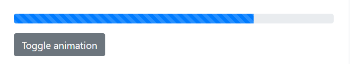
[√] 动画条纹 条纹渐变也可以有动画效果。为 .progress-bar 添加 .progress-bar-animated 即可利用 CSS3 动画功能添加条纹从右到左滚动的动画效果。
1 2 3 <div class ="progress" > <div class ="progress-bar progress-bar-striped progress-bar-animated" role ="progressbar" aria-valuenow ="75" aria-valuemin ="0" aria-valuemax ="100" style ="width: 75%" > </div > </div >
alec:
animation,动画
animal, 动物
stripe,条纹
trigger,触发
[√] 2.2 - 实操 (1)引入bootrap文件
1 <link rel ="stylesheet" href ="../libs/bootstrap-3.3.7/css/bootstrap.css" >
(2)添加一个
;
(3)在
中添加一个
1 <div class ="progress-bar" aria-valuenow ="40" aria-valuemax ="100" aria-valuemin ="0" style ="width:40%;" >
aria-valuenow=”40”——进度条目前进度值。
aria-valuemax=”100”——最大进度值。
aria-valuemin=“0”——最小进度值。
style=”width:40%;”——让进度条指在40%的位置。
完整代码如下:
1
2
3
4
5
6
7
8
9
10
11
12
13
14
15
16
17
<!doctype html > <html lang ="en" > <head > <meta charset ="UTF-8" > <title > 进度条</title > <link rel ="stylesheet" href ="../libs/bootstrap-3.3.7/css/bootstrap.css" > </head > <body > <div class ="container" style ="width: 600px" > <p > 默认的进度条</p > <div class ="progress" > <div class ="progress-bar" aria-valuenow ="40" aria-valuemax ="100" aria-valuemin ="0" style ="width:40%;" > </div > </div > </div > </body > </html >
[√] 3 - 零散知识点积累 [√] 前端中的div
在前端开发中,div(全称:division)是一个常用的HTML标记元素,通常用于将文档分成多个部分,以便更好地组织和呈现内容。
div元素不会为内容提供任何特殊的含义,而只是将一部分内容包含在内,并为其提供样式和布局。在CSS中,div元素是最常用的布局容器之一。通过为div元素定义样式,可以控制其在页面上的位置、大小、背景颜色等等。div元素可以嵌套在其他div元素中,从而创建出复杂的页面布局。
以下是一个简单的示例,演示了如何使用div元素来创建一个包含标题和段落文本的简单页面:
1
2
3
4
5
6
7
8
9
10
11
12
13
14
15
16
17
18
19
20
21
22
23
24
25
26
27
28
29
30
31
32
33
34
<!DOCTYPE html > <html > <head > <title > My Website</title > <style > .container { width : 800px ; margin : 0 auto; padding : 20px ; background-color : #fff ; border : 1px solid #ddd ; } h1 { font-size : 36px ; color : #333 ; margin-bottom : 10px ; } p { font-size : 18px ; color : #666 ; line-height : 1.5 ; } </style > </head > <body > <div class ="container" > <h1 > Welcome to my website</h1 > <p > Lorem ipsum dolor sit amet, consectetur adipiscing elit. Sed euismod auctor enim, eu dapibus turpis iaculis vel. Nulla facilisi.</p > </div > </body > </html >
在上面的示例中,我们创建了一个包含标题和段落文本的简单页面。首先,我们创建了一个div元素,将标题和段落文本都包含在其中。我们给这个div元素添加了一个名为“container”的类,然后在CSS中定义了这个类的样式。我们通过设置width、margin和padding等属性来控制div元素的位置和大小,并为其添加了一个白色的背景和边框。我们还定义了标题和段落文本的样式,以使它们看起来更好看。
总之,div元素在前端开发中是一个非常有用的工具,可以帮助开发人员更好地组织和布局网页内容。
[√] Bootstrap简介 Bootstrap是一个开源的前端框架,由Twitter开发和维护。它包含了HTML、CSS和JavaScript的组件,可以快速构建现代、响应式的网站和应用程序。
Bootstrap的核心理念是通过提供一套可重复使用的CSS样式和JavaScript插件,简化前端开发流程,提高开发效率。它使用了一套基于栅格系统的布局,使得网站能够在各种设备上呈现出统一的外观和行为。
Bootstrap支持各种常见的组件和插件,如导航栏、轮播图、模态框、表格、表单等等。这些组件已经经过设计和测试,能够适应各种常见的使用场景,并且能够通过简单的HTML标记和类名来使用和定制。
Bootstrap的优点在于:
快速开发:提供了可重复使用的组件和模板,简化了前端开发流程。
响应式设计:支持栅格系统和自适应布局,能够适应各种设备的尺寸和分辨率。
浏览器兼容性:兼容各种现代浏览器,并且提供了兼容性处理的JavaScript插件。
社区支持:有庞大的社区支持,能够快速获取帮助和解决问题。
定制性:提供了丰富的定制选项,能够根据项目需要进行定制。
总的来说,Bootstrap是一个功能强大、易于使用、高度可定制的前端框架,适用于各种类型的网站和应用程序。
7 - hexo博客添加学习进度页面
https://alec-97.github.io/posts/3780537372/